Interview with Dr. Catherina Cader from Reiner Lemoine Institut. She talks about the application of spatial data for the EnerSHelF project.
In a previous interview, you and your colleague Philipp Blechinger introduced the objective of work package 3.4 within the EnerSHelF project. What has been achieved since then?
Since the last time we spoke, we deep dived into the data collection, assessment, and analysis to get an understanding of what kind of geo-spatial data is available. We put a strong focus on collecting and compiling all the data which have location specific attributes – meaning geo-coordinates. One part of this process is the visualization. We display the data in maps with different foci – for instance by extracting attributes for the regions of Ghana – and overlay different datasets to generate new insights. Fortunately, we were quite successful in identifying several datasets that work towards our project goal. For some, we were able use them as they were while others needed some post-processing to make them more useful for our purposes. For now, that was one of the key objectives before working towards the goal of developing an electrification strategy.
In the EnerSHelF’s annual meeting, you presented preliminary results of your GIS data analysis. Can you explain the incentive of looking at spatial data and what it tells us?
Spatial data is very helpful to get a good understanding of local differences. When looking at a large country, we need to identify certain local attributes and characteristics. To make it a bit more concrete, I can give a specific example based on Figure 1.
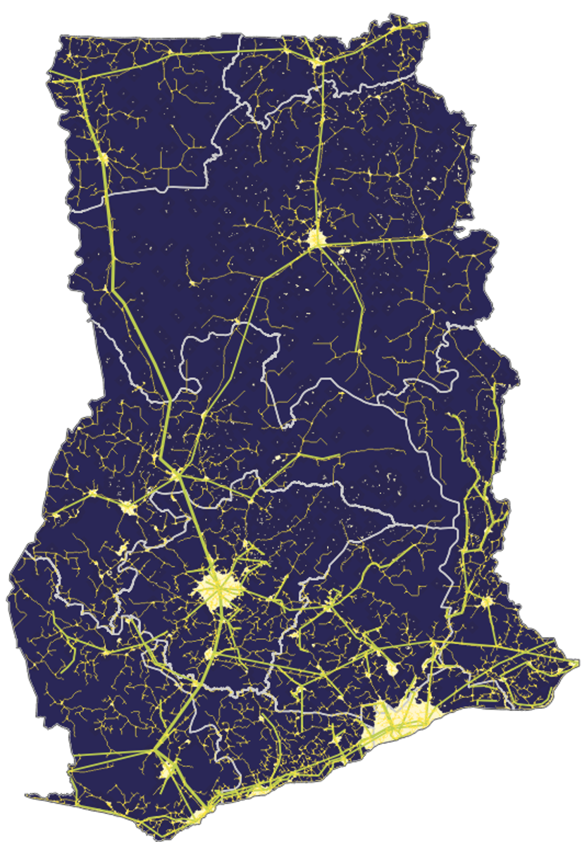
On the one hand, we need to understand how good the overall electricity supply is to be able to enhance it. For this purpose, we map information such as the existing electricity grid. On the other hand, we added the dataset on light emissions at night – the common image of a world at night where the major mega cities appear as bright spots. We can use this information as an indicator that there is some form of electricity supply, either from the central grid or a decentral power source – for example from local diesel generators which may not be connected to larger distribution networks. This analysis helps us to understand how electricity supply is spatially distributed.

Then we looked at different datasets on locations of health facilities in Ghana as highlighted in Figure 2. We overlayed these with the previously mentioned maps to understand where health facilities are likely to have a good energy supply and where it lacks. For regions with limited electricity supply, the PV-based solutions we are focusing on might be much more relevant than for areas with a stable grid. When looking at the health facilities, we also connect our findings to the surrounding communities.
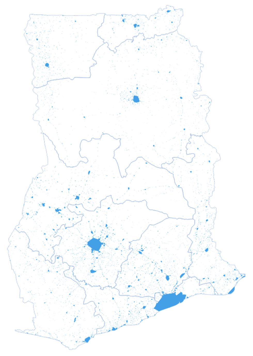
Therefore, a third data type we looked at is on population distribution as displayed in Figure 3. We derived information on where we have settlements to understand which ones are nearby health facilities. To do so, we created Voronoi polygons – which are shown in Figure 4 – which help us to understand the distance of surrounding communities to the health facilities. This is an indicator for which clinic people are most likely to visit in case they need health services. With this step, we create the relationship between the surrounding communities and the health facilities.

One main objective to use this geo-spatial approach is of course to make it much more visual. We may have all this different information in form of tables. For instance, there is a list of all health facilities but when we look at these lists, it is very abstract to understand spatial relations. One example would be the divergence between rural areas with insufficient electricity supply and urban areas with a more reliable grid. Visualizations through maps are also beneficial for our communication with other stakeholders. It is quite easy to look at maps to get a first impression – much easier in some regard to some complicated excel files that may contain the same information but are much harder to understand.
How does the GIS data analysis feeds into your goal to develop an electrification and market introduction strategy for PV hybrid systems for health care centres and surrounding communities in Ghana?
To give an answer to this question, we must look at the other work packages and their recent progress. At EnerSHelF, we do have three pilot sites where we get detailed information from PV-systems and measurement devices that have been installed by other work packages. This gives us the best kind of data because the most accurate data is locally measured data. In our working package, our goal is to extrapolate the findings and to understand what it means when we look at the whole country and not just at a pilot site. Therefore, we need to include geo-spatial datasets to grasp how we can transfer findings to derive a country-wide market-introduction strategy and to understand what the market for such PV-hybrid systems is.
One key advantage of the datasets we are using is that they are openly available. By using this data, we are making it more prominent and invite others to use it as well. An increasing number of datasets become available these days, which has not been the case ten years back – great progress in terms of open data.
So far you collect data and carried out a detailed analysis. What are the next steps?
The next steps will be to use the data to feed our simulation models and think about how to size systems. To do so, we need to understand what the optimum system size would be at each site considering the health facility plus the surrounding community. And that brings us to one of the challenging parts of the project: We scheduled surveys which we are yet not sure how to conduct due to Covid-19. But nonetheless, the geo-spatial datasets are an advantage as they allow a certain amount of deskwork which will still produce valuable insights.
As mentioned before, we did the GIS analysis by post-processing and combining datasets so that they were ready for our purpose. The next step is to size systems and to understand how we can extrapolate them to the whole county. At this point we need to define the healthcare centres and the surrounding communities to aggregate these findings for different regions in Ghana. Our goal is to be able to predict the PV-hybrid system size needed for specific health facilities to supply both the clinic as well as surrounding community and scale this into a country-wide market potential. Finally, we plan to make the geo-spatial data available online through a webmap platform where all interested parties or stakeholders can independently discover the findings. We are about to start its implementation soon.
Interview by Jonas Bauhof